Sunday 22 April 2012

Evaluation. . .

Once I had managed to form an idea of my chosen setting to execute a fantasy exhibition, settling on the concept of using a stage for a performance, I considered several different staging areas and possibilities, I felt the stage of the RSC Theatre would be best for rein-acting my performance exhibition. Deciding on Waiting for Godot was based around the simplicity in characters, plot, staging and set, but also in terms of the ideas it presents; the themes of time/reality/relationships/search for meaning are all intriguing ideas for works of art I could potentially use, opening up several branches of investigation.

I collaborated four artworks with the performance, allocating specific actors and mapping out the exact location of each piece within my space, considering the effect the set will have upon the audience. Other than the visual aesthetic appearance, I thought about using sound art, although dismissed the idea by the outcome. I also reviewed the effects of lighting, hence Parker's piece that projects shadows onto the stage making it eerie and melancholic, further alluding to the sense of an evening country road.

The intention of my performance exhibition is to collaborate performance within the theatre with various contemporary artworks to convey this theme of an ongoing search for meaning and the human struggle. Notions of the passing of time and the waiting for something better are suggested in the performance and in the artworks; both reinforce the ideas of the other.

I found some areas of difficulty in considering where to locate the artworks amongst the set design as I was working with large scale works on a small stage, but worked around any issues that I had by moving Parker's sculpture off of the stage and into the space above, making full use of the area. Another issue I encountered was the labelling of works; obviously I couldn't do this directly on the stage. Instead of labelling the works themselves, I placed the titles/names/descriptions/dates, etc. in a performance programme that would be distributed to the audience members on entering the theatre.

The concept behind the performance exhibition was an endeavour to curate sculptural/installation works in parallel with a live performance experience so the artistic set design is acknowledged. Furthermore, the artworks that act as props on the stage echo the themes that run throughout the continuous play being acted out on the stage. I have made another point of interest by including myself, as the curator/director, to  play a character onstage. By allocating the other actors specifically, I was free to choose whomever I wanted in my fantasy cast, so chose the people who I felt would rein-act the characters as I imagine they should be. After looking at all female casts/productions in context etc. I endeavoured to encompass a variety of different actors and actresses.

To improve on my virtual exhibition I would consider the possibility of having the sound of a ticking clock in the background of even artworks upon the balconies (i.e. paintings hanging up so the audience experiences that type of medium before seeing the play). The overall experience of the collaboration of performance/sculpture/installation would be one of interest in any space; I could perhaps take this further by putting the performance in public spaces or in specific meaningful places (i.e. the performance in Sarajevo, etc.). 


Exhibition Programme. . .


Exhibition Programme - Here I have made an Exhibition Programme to distribute to people who come to the show so the audience knows a) who is in the play and b) the information on artworks within the set

(Also see sketchbook for printed copy)

Leaflet/Poster for Exhibition. . .


Here I have photoshopped an image of my leaflet for my virtual exhibition.

I wanted the image to look as though it is from the perspective of the front of the stage, looking at Gallaccio's sculpture in the foreground and seeing the blurred Death Counter in the background.

I blurred the death counter image on photoshop and adjusted the levels, then applied a new layer of which I pasted the sculpture (cutting it out of its previous context and moving it within the frame of the new image) to look as though it was in focus, with the death counter out of focus, creating a sense of a long depth of field. I added highlights to the tree sculpture branches to look as though the spotlight (from above) is shining upon it.

I wanted to evoke a feeling of montage, so applied the text on top as though cut out from a newspaper. I also placed the fundamental quote 'They do not move' - the final stage direction used by Beckett at the end of both acts.

PRESS RELEASE. . .


THE WAIT.

PRESS RELEASE                            FOR IMMEDIATE RELEASE

Monday April 23rd-24th 2012
                Marianne.edwards@mail.bcu.ac.uk
Tel: 07914539791

            VLADIMIR: We can still part, if you think it would be better.
            ESTRAGON: It’s not worth while now.
                                  Silence.  
            VLADIMIR: No, it’s not worth while now.
                                  Silence.
            ESTRAGON: Well, shall we go?
            VLADIMIR: Yes, let’s go.
                                 They do not move.

     Samuel Beckett, Waiting for Godot

This exhibition bridges the gulf between the theatre and the arts, collaborating performance with sculpture to present an audience with a play interweaved with an artistic set design in the true sense of the phrase; the stage is composed of several artworks that, upon closer inspection mirror the concurrent themes within the play itself. The play presented is Samuel Beckett’s Waiting for Godot, a tragicomedy in two acts that is performed in a continuous loop on the stage.

The audience is automatically made aware of the intentions of the exhibition on entering the space; we are confronted with the huge, ever-ascending digital numbers of Santiago Sierra's Death Counter (2009) that has been placed upon the back wall of the stage. The installation piece marks the exact number of deaths worldwide each second. It is an imposing juxtaposition upon the almost-bare stage giving us the continuous reminder of the increasing proximity of our own fatal outcome. Beneath this lies the solitary work of Anya Gallaccio’s Because I Could Not Stop (2002), marking the centre of the stage, evoking notions of the passing of time as central metaphor to the performance acted around the sculpture, symbolized with the gradual natural decay of the real fruit that adorns the bronze frame.

The Wait. combines contemporary installation and sculpture with a production of one of the most influential post-war plays of the 20th century foregrounding melancholic themes of futility and a desperation to find meaning in life that a present-day audience can relate to.

“I wanted to present a contemporary audience with notions of the human search for meaning and the inevitable realization that all we can do is hope. Where better to exhibit this than upon a stage?” says Marianne Edwards, curator of the exhibition.


         -  MORE  -


“The stage functions as landscape for the artistic wasteland; it foregrounds the awareness that the erratic characters that act upon it are not real, they are merely metaphors for the human condition that demonstrate a universal suffering.

Humanity is stripped to its core, revealing the gravity of the deepest and darkest human emotions and needs, leaving you to face the inevitable truth – there is no escape, only perseverance. The only act is that of holding on.”

- END - 

Saturday 21 April 2012

Allocating actors. . .

My Virtual Cast

Morgan Freeman - Vladimir

Sir Ian Mckellen - Estragon

Dame Judi Dench - Pozzo

Kevin Spacey - Lucky

Me - Boy

Friday 20 April 2012

Perspective from Right Upper Circle (Balcony). . .


1. = Cold Dark Matter

The * marks the shadow impression that would occur upon the stage.

Light would come from above, shining through the suspended sculpture. Mimics the appearance of a huge chandelier, suspended from hundreds of strings of invisible thread/fishing wire.

Issues with arrangement of artworks. . .

My initial idea of where to locate Parker's Cold Dark Matter was to place it at the forefront of the stage. However, in considering the viewpoint of the audience, those seated front-on would be experiencing a block of vision towards the centre of the stage.

Thus, I would relocate Parker's sculpture to a much higher level; those seated at the circle and/or upper circle would  be able to see it at eye level, then look down to the stage where the projection of the sculptures exploded parts would create shadows on the floor of the stage. I would place a spotlight above the sculpture so the lighting is limited to the stage itself, giving it the impression of an evening setting that Beckett wanted, while allowing the shadows to shine through. Those looking up from the stalls would also be able to see the work, as it would be above the stage itself and within eyesight. 

My interpretation of the stage from the front. . .


Initial Set Design. . .


E = exit/entrance

P = pathway

A = audience/seating

1. = Anya Gallaccio

2. = Santiago Sierra

3. = Anna Barriball

4. = Cornelia Parker


Light projected from pathway onto parker's piece in order to create shadows onstage.
I feel dimensions of shadows would add to the ambiguity onstage, and so would like to include a sculptural piece that enhances the atmosphere.


I was thus interested in the way in which Parker's Cold Dark Matter produced beautiful shadows when a spotlight is placed at its centre. When drawing up my plan of the set design, I will try to include this work to add another element to the atmosphere onstage.

Parker's piece is an exploded view of a garden shed; the miscellaneous items allude to a sense of pandemonium further that is reiterated throughout the play, and the locating of this particular piece would ultimately hold as central metaphor for this unnerving sense of something scattered and hap-hazardous. The erratic nature of the characters is reflected in the disorderly form of the sculpture.

The sense that a split second of time (when the shed explodes) has been captured and preserved holds further parallels to the nature of the play.

 Estragon: Well, shall we go?
Vladimir: Yes, let's go.

They do not move.


I want to add a further dimension to the performance that is observed by the audience as they are watching the rein-acted performance. On the back of the stage I would like to include Santiago Sierra's Death Counter whereby the giant LED sign registers the anual number of deaths worldwide over the course of a year, starting from scratch at New Year.


The increasing numbers would continue to escalade while the audience is watching the performance; this would give a greater awareness of the effects of Time and the power of its passing. The 'waiting' in WFG is thus made universally applicable to the audience watching Vladimir and Estragon's suffering as they waste away their lives waiting for their Godot, who ultimately is never seen by the audience, foregrounding an awareness of futility.
"I don't seem to be able... (long hesitation) to depart."
- Samuel Beckett, Waiting for Godot


The only change to the set throughout the performance is the leaves upon the tree; I would not be able to alter Gallaccio's bronze tree, but could compromise by applying leaf-like artwork to the floor during the interval between the acts.

One artist of interest regarding the concept of reality is Anna Barriball.

" We always find something, eh Didi, to give us the impression that we exist?"


Barriball's embroidered leaves evoke a sense that things are not quite as they seem or how you expect them to be; a theme that is suggested multiple times within the play. The leaves would appear after the interval of the performance in order to suggest a sense of time passing onstage. 

CHOOSING MY ARTWORKS. . .

The most dominant part of the simple stage design of Waiting for Godot is the solitary tree that stands onstage during both acts.

In terms of artworks I would use for this central aspect of the play, I have considered a few sculptures but decided Anya Gallaccio's Because I Could Not Stop, 2002 would be the most interesting central piece to my stage.


Here, Gallaccio adorns a bronze tree with real decaying apples; the apples would thus gradually decay over the course of the performance exhibition showing, alluding to the theme of the passing of Time that is concurrent with the play being acted on the stage. This creates several parallels throughout the performance; the unison of the bronze structure and the decaying matter juxtapose one another, and the acted out scenes that are undergone beneath the tree where many discussions lead to an awareness of ageing, the experience of perseverance and the inevitable passing of Time itself. 


The further subtleties of the allusion to the book of Genesis are also interesting to the overall exhibition; the apples on the tree refer to the forbidden fruit eaten by Adam and Eve - many references to biblical text are demonstrated throughout the play.

VLADIMIR 
(musingly) The last moment . . . (He meditates.) Hope deferred maketh the something sick, who said that?

Similarly, the notion of ephemerality and temporality would work well when put with WFG.


VLADIMIR 
Two thieves, crucified at the same time as our Saviour. One—
ESTRAGON 
Our what?
VLADIMIR 
Our Saviour. Two thieves. One is supposed to have been saved and the other . . . (he searches for the contrary of saved) . . . damned. (1.62-64)


Poster for WFG performed in Sarajevo.

Various productions have been made since its first production in England in 1955, directed by Peter Hall. The various productions rely heavily on the context in which they are being shown and the audience they are being shown to. During the Bosnian war where people were forced to rely heavily on hope, a production of Waiting for Godot was conceived.

Similar contextual productions were made, such as an all female casting; this was highly controversial - The Beckett Society were strongly against the making of this particular production.

I would like my production to echo similar contextual resonance, focusing on the specific artworks I use in my set design. I would also like to allocate specific actors to play the five characters in the play.  

Props used/Main stage directions. . .


  • A turnip 
  • The stub of a carrot

  • A rope

  • A whip
  • Bag
  • Stool
  • Basket
  • Bones from chicken
  • Bottle of wine
  • A pipe

Other items mentioned:
  • Pozzo's vaporizer
  • Each characters' hat used as prop
  • Estragons' left boot


Cover of Waiting for Godot copy cover by faber and faber


Here seen is all characters and props seen onstage; the four main characters (excluding BOY), a tree (the only recognisable sign of time passing), props used onstage - i.e. a whip, bags, etc.

Thursday 19 April 2012

Act 1 and 2 are essentially mirrored, making the stage open to place artworks within the simple setting of a derelict wasteland-like road where the play takes place. The only way in which the setting is altered between act 1 and 2 is when the solitary tree appears the next day with leaves upon the tree; I will take this into consideration when deciding which artworks to use in my performance exhibition.

ACT 2

Next day. Same time. Same place.

ACT 1

A country road. A tree. Evening.

Examples of Stage Design for Waiting for Godot. . .


WAITING FOR GODOT. . . "nothing happens, nobody comes, nobody goes, it’s awful."

One of my favourite plays that is extremely simple in staging and lacks complexity in plot in Becketts' Waiting for Godot. The tragicomedy consists of two acts that are both very similar in structure, allowing good flexibility of a set design in which I can situate various works of art.

http://www.youtube.com/watch?v=b542GxhzYiw

(URL to The Dublin Gate Theatre production of WFG)

The limitations in characters/plot/setting changes would make an exhibition more easily conducted amongst the performance.


Choosing a play. . .

In order to carry out an exhibition onstage amongst a rein-acted play, I would have to choose a specific play that: 

a) could be played on a loop, continuously so any member of the audience can pass in or out at                               any point as they please and still understand the concepts of the exhibition

b) would be concurrent with the pieces within the exhibition

c) would have relatively few staging complications (i.e. moving of props, complex characters, etc.) to allow my chosen artworks to remain in the allocated positions on the stage throughout the performance

Thinking about how to inform the audience about the artworks they look at. . .


Programme for play states artists names/dates/mediums/title of work. Each person is given one at beginning, on entering the arena. People are free to sit where they wish, and move about as they please, but the arena must remain silent so others can experience the performance.

Wednesday 18 April 2012

Considering the experience of a staged exhibition. . .

With a seating capacity of 1,040 people, my virtual exhibition would never be completely full if it was in reality; this however would add to the effect - with people passing in and out throughout the performance, the awareness of something fleeting and temporal would be evoked; people pass through the exhibition, some would stay and watch the performance onstage, some would walk around.  

Examples of simple stage plans. . .


Composing a linking idea. . .

NOTES:


Focus on performance art/drama/artistic set design. . .

- Mimic experience of a THEATRE  via   --> performance
                                                                   -->  experience of a stage and an audience


Acts = stages of the exhibition?

THEME.... concurrent with sculptural/video/painterly art works and the performance that the audience who come to the exhibition will experience. . . experience something that makes sense when put together (i.e. a play rein-acted that demonstrates themes of time combined with sculptures that the audience will see on stage while the play is being acted out, creating a collaboration of different works and mediums upon a stage)


  • Theme of TIME. . ?
  • incorporate various artists that deal with time in different ways
  • onstage = one performance
  • play with the idea of artistic set design

  • THE STAGE IS BUILT FROM ARTWORKS IN WHICH THE PERFORMANCE IS REIN-ACTED - i.e. the artists' works become props and the experience of viewing the props in situ with the performance is the exhibition.

Drawn out plan of how Twelfth Night was seen from the audience. . .


I did a quick sketch of how the set design was organised and arranged onstage with my iPad using the Paper app in order to make clear how the audience saw this particular play.

A. = Audience seating

The blue in the top left hand corner of the stage representes where the water was; diagonally oposite to this is where gravity ceases to exist and the double bed, along with the bath tub above it leads the audience up higher.

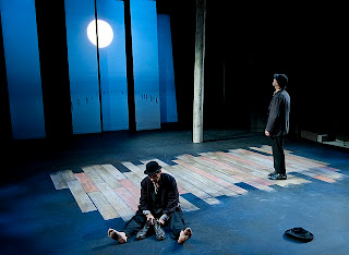
The lighting is another aspect I may consider when arranging artworks within the space of a stage; in this performance, broken planks of wood were suspended from the ceiling with a spotlight shining through so this vague, distorted outline of shadows was projected on the floor. Upon viewing this, I was immediately reminded of Cornelia Parkers' work with lighting called Dark Matter whereby the shadows are as much part of the piece as the exploded shed itself.

Aspects i may also wish to consider would be the mediums I would ultimately include on my stage of art. I would like to use a performance, but combine this with sculptural works that evoke the meaning that the play is trying to convey; artworks become props upon a stage, and reality is lost to the audience that watches the exhibition.

Traditional ways of experiencing plays. . .

The RSC Theatre


Traditionally, people viewed plays within a three-tiered arena, whereby the position in which your seat was reflected your status in society. The RSC stage reflects this archaic way of experiencing drama and performance. The three tiers of stalls, circle and upper circle are still used in the RSC theatre. The way in which the audience circles the stage enables broad creative potential in terms of the varying ways the actors can communicate and connect with a large-scale audience; they are able to easily enter and exit from a range of positions allowing the set design and prop manoeuvring to expand in possibilities.

PLAN


The idea of artistic set design. . .


After experiencing many different plays upon various stages, I looked at plans of several of these, ranging from the open air theatre in London to the Wooster Group Theatre stage in New York. I decided that the most interesting style of stage was that of an archaic shakespearean stage, one I am most familiar with, after viewing most plays at my local theatre at the RSC.


After recently seeing a specific performance of Twelfth Night at the rsc, whereby the stage set design was radically altered, I confirmed this setting as ideal for basing my virtual exhibition; the set of Twelfth Night went from a corner of the stage being a pool of water where characters emerge from and fall into to a bedroom-like setting that completely defies gravity - a bed stands almost upright, dragged by the escalating floorboards, leading up to the semi-floating old fashioned bath tub.

The lack of sense and refusal to accept the inevitable falling of objects caused by gravity reinforces the concurrent themes throughout the play itself; notions of madness, disorder and a complete lack of sense. The chaotic nature of the set design and the locating of the props create these dimensions to the play. Further more subtle hints were the occasional ticking of a clock that resonated though the stage; the epitome being the striking at which point the character Olivia states 'The clock abades me with the waste of time'; sound dimensions to my stage set up would be an intriguing idea to play with within the space to create a sound art/performance exhibition. 


Set designs have various repercussions in terms of conveying meaning within the play itself, and here with Twelfth Night, the artistic content lies within the use of props and their positioning (much like the act of curating itself) and ultimately the props themselves as they cast various shadows and moods upon the stage, reinforcing the audiences' reaction to the play.


http://www.youtube.com/watch?feature=player_embedded&v=GcG5qzkd_Hw

(URL to the trailer)


The RSC Swan Theatre stage; view from top of stage, looking at audience.

Looking at STAGES to perform my EXHIBITION


Fabian       If this were play'd upon a stage now, I could condemn it as an
                  improbable fiction.


(Fabian, Twelfth Night, Act 3, scene 4, lines 126-128

INITIAL IDEAS. . .

'I dreamed of something original and unknown. . . '    -    Rodchenko 1935


Fantasy Curation

I will endeavour to extract ideas from my work in the personal project to trigger imaginative ideas to create a virtual exhibition combining a series of works.

Most of my work in my current project revolves around performance, so I would ultimately draw inspiration from notions of performance, drama and the audiences' experience of watching a play upon a stage.